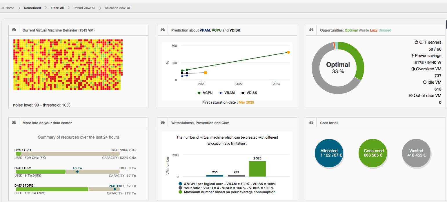
The Dashboard is the home page of the solution. It provides a three-axis assessment of the state of the datacenter: The first column summarizes the status of the datacenter; the second column represents the evolution of the datacenter and includes a light version of the Capacity Planning and the third column summarizes the potential optimization and provides a cost analysis of the infrastructure.
Status of the Datacenter
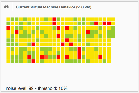
The first frame provides a view of all virtual machines running in the datacenter. Each virtual machine is represented by a colored box. The color varies according to the status of the virtual machine. This status is defined by the averaged consumption values of processor and memory reported by the operative system in the virtual machine during the analyzed period. For more information on the definition of the different status of the VM, please refer to the Glossary section.

Passing the mouse over the boxes will show the name, status, RAM and CPU consumption percentages of each virtual machine. The message Not available data indicates that there has not been consumption detected in the virtual machine during the analyzed period.
If the box is clicked, you will be redirected to the Graph On Demand module, where you will be able to see the consumption curves associated to the virtual machine. For more information please refer to the Graph On Demand section of this guide.
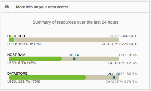
The second frame shows the activity of the datacenter according to its capacity during the last 24 hours. Three resources are analyzed: CPU, RAM and Storage consumption. The blue indicator over the line represents the total amount of resource allocated/provisioned to VMs. The average resource consumption is represented in the indicator Used below each line.
Evolution of the datacenter
The central column relates to the evolution of the datacenter.
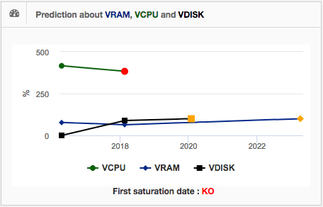
The first frame provides the saturation dates for each resource: VRAM, VCPU and VDISK. The legend at the bottom of the frame: «First saturation date» indicates the first saturation date for a defined resource.
The second frame shows the number of virtual machines that can be created in the infrastructure. The green column represents the maximum number of VM's that can be created based on the average VM consumption in the analysis. The blue column represents the maximum number of VM's that can be created based on VMware best practices' and the grey column represents the maximum number of virtual machines that can be created according to the allocation over commitment parameters set in the Capacity Planning Settings.
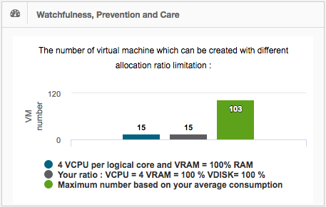
For more information please refer to the Capacity Planning Settings of this document.
Optimization and cost analysis
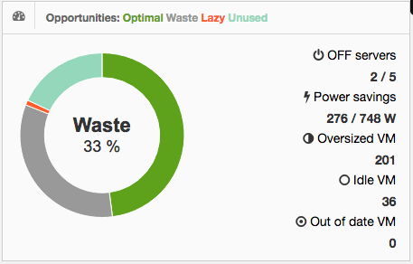
The frame Opportunities in the third column, shows the resources that could be saved by following the recommendations provided by DC Scope. The tool simulates the effect of the following optimizations:
- The deletion of virtual machines labeled Idle.
- The resize of virtual machines labeled Oversized.
- The consolidation of all the VMs in the minimum number of servers, who will be then running at their maximum capacity.
Based on this simulation, four counters are presented to define the potential savings in the infrastructure:
-
The counter Lazy displays the resources consumed by virtual machines labeled Lazy . These virtual machines consume little resources. Their behavior must be analyzed to decide whether they should be eliminated.
-
The counter Optimal displays the resources consumed by servers in the simulation.
-
The counter Unused displays unused resources on servers in the simulation.
-
The counter Waste displays the resources of servers that will not host any VM in the simulation and therefore can be turned.
The Power Savings rate in the frame, shows the electric consumption of the datacenter optimized versus the current electric consumption.
Clicking on the OFF Servers tittle will provide the list of servers that can be turned by following the recommendations provided by DC Scope.
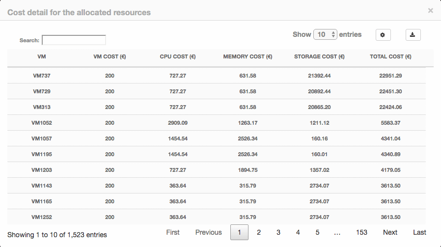
The second frame of the column provides the cost of the infrastructure. This frame shows the cost for the analyzed scope according to the filters. This allows you to calculate the cost per project, perimeter or cluster, or to calculate the cost of the total infrastructure.
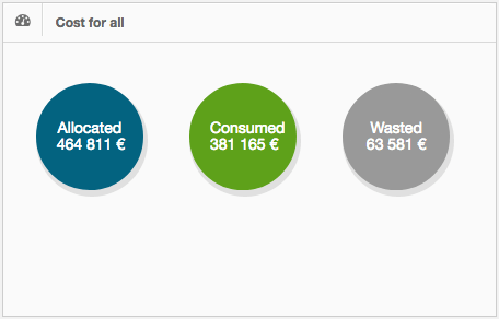
DC Scope includes by default a list of costs that corresponds to an average cost of our clients. These costs can be customizable to your own requirements. In order to set this cost either individually (by VM) or generally, please refer to the Cost Definition Settings.
Based on the assigned costs, DC Scope automatically calculates the costs: Allocated,__Consumed and Wasted:
Allocated: the cost of the resources allocated.
Consumed: the cost of the resources consumed.
Wasted: the difference in cost between the resources allocated and the resources consumed for all VMs; except for those VMs that are not considered oversized (VMs identified as normal, undersized or busy).
A detail costs by VM and resource is provided by clicking on each circle.